Choosing the perfect paint palette can transform your living space, creating an ambiance that reflects your personality and style. Whether you're redecorating a single room or revamping your entire home, mastering the art of color selection is essential. The right colors can enhance the architectural features of your home, influence mood, and even affect the perceived size of a space. Understanding the nuances of color theory and how different shades interact can help you create a cohesive and inviting environment.
Understanding Color Theory
Color theory is the foundation of selecting the perfect paint palette. It involves understanding the color wheel, which consists of primary, secondary, and tertiary colors. Primary colors—red, blue, and yellow—are the building blocks of all other colors. Secondary colors are created by mixing two primary colors, while tertiary colors result from mixing primary and secondary colors. Familiarizing yourself with the color wheel helps in creating harmonious color schemes, such as complementary, analogous, and triadic combinations. Complementary colors, located opposite each other on the wheel, create vibrant contrasts, while analogous colors, found next to each other, offer a more harmonious look.
Considering Room Function
The function of a room plays a significant role in choosing the right colors. For instance, calming colors like blues and greens are ideal for bedrooms, promoting relaxation and tranquility. In contrast, vibrant colors such as reds and oranges can energize a space, making them suitable for social areas like living rooms or dining rooms. Neutral colors, including whites, grays, and beiges, offer versatility and can be used in any room to create a balanced backdrop that allows other design elements to shine. Understanding the purpose of each space ensures that the chosen colors enhance the room's functionality.
Evaluating Natural Light
Natural light significantly impacts how colors appear in a space. Rooms with ample sunlight can handle darker or more saturated colors, as the light will enhance these hues. Conversely, rooms with limited natural light benefit from lighter colors that reflect available light, making the space feel brighter and more open. It's important to observe how natural light changes throughout the day, as colors can look different in morning light compared to evening light. Testing paint samples on different walls and observing them at various times can help in selecting colors that work well with the room's lighting conditions.
Testing Paint Samples
Before committing to a paint color, testing samples is a crucial step. Paint small sections of the wall with your top color choices and observe them over a few days. This allows you to see how the colors look in different lighting conditions and how they interact with other elements in the room, such as furniture and flooring. It's also helpful to test samples on multiple walls, as colors can appear differently depending on the angle and light exposure. Taking the time to test samples ensures that you're confident in your final color choice.
Creating a Cohesive Flow
To create a cohesive flow throughout your home, consider how colors transition from one room to another. Using a consistent color palette or variations of a single color can unify different spaces, providing a sense of continuity. This doesn't mean every room must be the same color, but rather that the colors complement each other and create a harmonious flow. Accent colors can be used strategically to highlight architectural features or create focal points, adding interest and variety without disrupting the overall cohesion.
Incorporating Accent Colors
Accent colors are an excellent way to add depth and personality to a space. They can be used to draw attention to specific areas, such as an accent wall, or to highlight architectural features like moldings or built-in shelves. Accent colors can be bold and vibrant or subtle and understated, depending on the desired effect. When selecting accent colors, consider using the 60-30-10 rule: 60% of the room should be the dominant color, 30% a secondary color, and 10% an accent color. This approach ensures a balanced and visually appealing design.
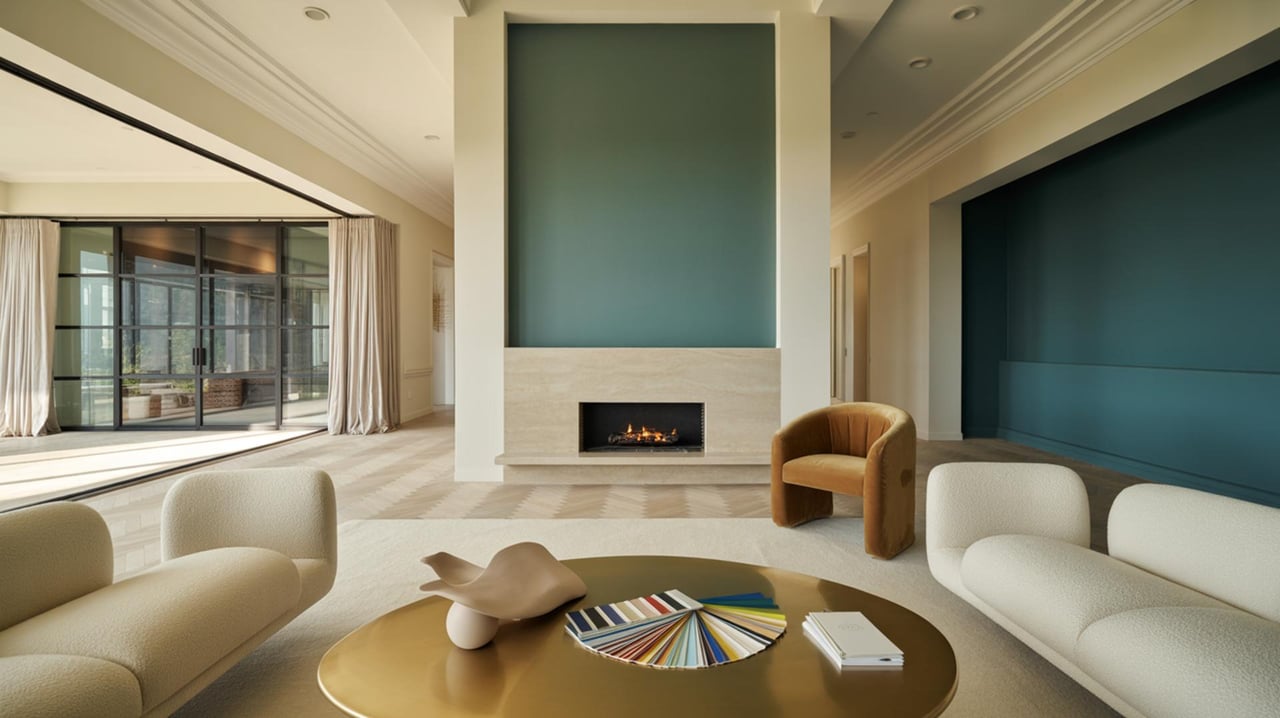
Balancing Warm and Cool Tones
Balancing warm and cool tones is essential for creating a comfortable and inviting atmosphere. Warm colors, such as reds, oranges, and yellows, evoke feelings of warmth and coziness, making them ideal for social spaces. Cool colors, like blues, greens, and purples, are calming and refreshing, suitable for areas meant for relaxation. A well-balanced palette incorporates both warm and cool tones, ensuring that the space feels neither too stark nor too overwhelming. Consider the room's purpose and desired mood when deciding on the balance between warm and cool colors.
Considering the Impact of Undertones
Undertones are the subtle hues that lie beneath the main color and can significantly affect how a color appears. For example, a beige paint may have pink, yellow, or green undertones, which can influence how it looks in different lighting conditions. Understanding undertones is crucial when coordinating colors, as clashing undertones can disrupt the harmony of a space. When selecting paint colors, compare them against other elements in the room, such as flooring, furniture, and fabrics, to ensure the undertones complement each other.
Using Color to Alter Perception of Space
Color can be a powerful tool in altering the perception of space. Lighter colors can make a small room feel larger and more open, while darker colors can create a cozy, intimate atmosphere. Vertical stripes can make a room feel taller, while horizontal stripes can make it feel wider. Using color strategically allows you to manipulate the perceived dimensions of a space, enhancing its functionality and aesthetic appeal. Consider the room's size and shape when selecting colors to achieve the desired effect.
Staying True to Personal Style
Ultimately, the perfect paint palette should reflect your personal style and preferences. While trends can provide inspiration, it's important to choose colors that resonate with you and create a space where you feel comfortable and at ease. Consider your favorite colors, patterns, and textures, and how they can be incorporated into your home's design. Personal touches, such as artwork or decorative accessories, can further personalize a space, ensuring that it feels uniquely yours. Trusting your instincts and staying true to your style will result in a home that is both beautiful and meaningful.
Transform Your Space with the Right Colors
Choosing the perfect paint palette can truly transform your home, making it a reflection of your personality and style. With the right colors, you can create a space that feels welcoming and vibrant. Remember, the key is to select shades that resonate with you and enhance your living environment. If you're ready to explore the perfect colors for your home, reach out to Donald Lai for expert advice and guidance.